

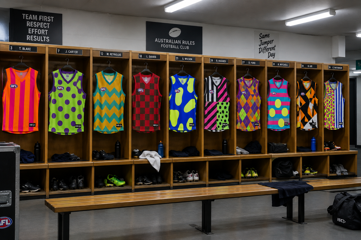
A great AFL guernsey becomes part of a club’s identity. Supporters wear it with pride, players become instantly recognisable in it and premiership memories become permanently attached to it.
A terrible AFL guernsey achieves something else entirely. It confuses supporters, assaults television cameras and leaves future generations asking one uncomfortable question: Who approved this?
After more than 27 years working with uniforms, sportswear and branded clothing, I understand that designing a new playing guernsey is not always as easy as it looks. Club colours, sponsors, tradition, visibility and supporter expectations all need to work together.
Even so, some designs cannot be defended.
Here is my completely subjective, occasionally unreasonable and absolutely final ranking of the 10 worst AFL guernseys of all time.
A quick warning: beauty is in the eye of the beholder. If your favourite jumper appears on this list, please direct all complaints to the graphics department that created it.
Number 10: Gold Coast Suns’ original guernsey
When you are creating a football club from scratch, getting the guernsey right should be near the top of the list.
You have no historical design to preserve, no century-old traditions restricting you and no former premiership captain demanding that everything remain exactly as it was in 1963. You are starting with a completely blank canvas.
Unfortunately, the original Gold Coast Suns guernsey looked as though the blank canvas had been handed to someone five minutes before the presentation.
The oversized GC logo felt more like a temporary placeholder than the centrepiece of a new AFL identity. The additional waves and curved design elements did little to improve it. They might have suited a Gold Coast tourism brochure, a surf school or the side of a jet ski, but they never looked particularly convincing on a football field.
The Gold Coast deserved a guernsey that felt bold, modern and unmistakably professional. Instead, the club entered the AFL wearing something that looked suspiciously like the first draft.

Number 9: Fremantle’s overdesigned anchor experiment
Fremantle FC entered the AFL with purple, red, green and white as its original colour combination. That is four colours attempting to occupy the same jumper before anyone had even added the sponsors.
The anchor was a logical idea. Fremantle is a port city, the Dockers name has a strong maritime connection and the symbol gave the new club an identity. My teenage son even loves the original Fremantle jumper, proving that every guernsey—no matter how controversial—will eventually find its audience.
But then came one of the club’s more adventurous patterned designs.
This was a reminder of one of the most important lessons in sublimated sportswear: just because modern printing allows you to cover every centimetre of a garment with shapes, gradients and patterns does not mean that you should.
The design had so much happening that the anchor appeared to be trying to escape from the jumper. Fremantle did not need more decoration. It needed someone in the design meeting to say, “That’s enough now.”

Number 8: St Kilda’s yellow clash guernsey
St Kilda FC is instantly associated with red, white and black. Those colours form one of the most recognisable combinations in Australian football.
Then yellow arrived.
To be fair, yellow does appear in St Kilda’s historical story. The club changed its colours during the First World War, and yellow later reappeared in clash designs. Historical explanation aside, the modern yellow clash jumper still looked completely out of place.
Rather than looking like St Kilda, it looked like a tub of Neapolitan gelato that had been left in the sun. Red, white, black and yellow were all competing for attention, and none of them appeared willing to compromise.
The more I look at it, the hungrier I become—and that is not normally the intended reaction to an AFL guernsey.

Number 7: Carlton’s yellow guernsey
If St Kilda’s yellow experiment was not warning enough, Carlton then decided to build an entire guernsey around the colour.
Carlton FC is known as the Blues.
Not the Yellows. Not the Lemons. Not the Highlighter Pens. The Blues.
Yet in 2009, Carlton ran onto the field in a predominantly bright-yellow guernsey. Somewhere between the design brief and the finished product, the club’s name appears to have been misplaced.
The famous Carlton monogram remained, but almost everything surrounding it suggested a different team. It was less “Old Dark Navy” and more “temporary roadworks ahead”.
A clash guernsey needs to create visual separation, but it should still look as though it belongs to the club wearing it. This one looked like Carlton had borrowed a jumper because its real kit was still in the wash.

Number 6: North Melbourne’s orange promotional guernsey
After St Kilda and Carlton experimented with yellow, North Melbourne FC apparently decided the only sensible response was to abandon royal blue for orange.
The Kangaroos wore the orange promotional guernsey against Collingwood in 2000. Presumably, it achieved its promotional objective because people are still talking about it. Unfortunately, they are mainly asking why North Melbourne was dressed like a completely different football club.
Royal blue and white is clean, traditional and unmistakably North Melbourne. Orange is not.
Unless you are the Greater Western Sydney Giants (Worse football team name of all time), making orange work on an AFL field is extraordinarily difficult. North’s version looked less like a considered evolution of the club’s identity and more like the team had been selected for an emergency traffic-control shift after the match.

Number 5: Collingwood’s barcode guernsey
This guernsey would normally deserve a much worse position than number five.
It is confusing, aggressive and capable of giving you a headache before the opening bounce. Unfortunately for Collingwood FC, the remaining four designs prove that Australian football has explored even deeper levels of visual despair.
The so-called barcode design took Collingwood’s famous black-and-white stripes and sliced them into lines of different widths. It was apparently inspired by the barcode in the club logo.
That may explain the concept, but it does not excuse the result.
Traditional football stripes are strong because they are simple and readable. Once those stripes were broken into a collection of uneven vertical lines, the players looked like supermarket products waiting to be scanned.
If you stare at it for long enough, a checkout may ask you to place an unexpected item in the bagging area.

Number 4: The Western Bulldogs’ pyjama guernsey
This Western Bulldogs FC design looked less like a football guernsey and more like something a child would wear to bed after receiving matching pillowcases.
Perhaps that was the performance strategy: wake up, skip getting dressed and head directly to the oval.
The design was busy, soft and strangely sleepwear-like. Instead of making the Bulldogs look fierce, it made them appear ready for hot chocolate and an early night.
I understand the concept behind experimenting with graphics and finding a fresh interpretation of the club’s colours. However, a playing guernsey still needs strength, clarity and enough visual discipline to look like elite sportswear.
This one needed less time on the football field and more time tucked under a doona.

Number 3: The original Brisbane Bears guernsey
The Brisbane Bears began with a koala as their mascot.
A koala, of course, is not actually a bear. That should have been the first clue that the branding process had taken an unusual turn.
The original guernsey combined a large BB monogram, a gold triangular panel and a collection of colours that looked as though they had been selected independently and introduced to one another on match day.
The design did not look intimidating. It looked like the uniform for a fictional delivery company from an Australian television comedy.
Even Warwick Capper—with the famous shorts, the hair and enough confidence to power the Gabba—could not make the jumper look right. If Warwick Capper cannot distract people from a guernsey, the guernsey is beyond saving.

Number 2: Hawthorn’s futuristic gold-and-white guernsey
Choosing between the final two guernseys was extremely difficult. Both deserve serious consideration for the title of worst AFL jumper ever produced.
Second place goes to Hawthorn’s futuristic gold-and-white experiment, often remembered as the “Power Rangers” design.
The jumper looked less at home on a football field than it would under flashing lights in a late-1990s nightclub. With its bold shapes, shiny appearance and futuristic styling, it appeared ready to fight an intergalactic villain rather than play four quarters of football.
In Hawthorn’s defence, brown and gold is not the easiest colour combination in professional sport. Rival supporters have traditionally described it using a considerably less flattering four-word phrase involving bodily functions.
Credit must therefore go to the club for trying something different.
Unfortunately, “different” and “good” are not interchangeable words.

Number 1: Hawthorn’s blue diamond guernsey
And the worst AFL guernsey of all time goes to Hawthorn FC —again.
Yes, the Hawks own both first and second place. It is an extraordinary achievement and probably the only back-to-back result the club will not be adding to its honour board.
The infamous 1995 pre-season guernsey replaced Hawthorn’s familiar vertical stripes with a blue base covered in brown-and-gold diamonds. White trim was then added around the neck and arms, presumably because someone looked at the diamond pattern and decided it was still too restrained.
The result has been compared to jockey silks, an argyle sweater and the sort of vest a nervous librarian might wear to a speed-dating night.
Nothing about it looked fast, powerful or intimidating. It made elite footballers look as though they were about to either ride in the Melbourne Cup or remind everyone that the library would be closing in ten minutes.
The guernsey did not merely ignore Hawthorn’s traditional visual identity. It packed that identity into a suitcase, drove it to the airport and put it on an international flight.
Hawthorn deserves credit for innovation, but this is what happens when innovation is left unsupervised.

Special mention: The Western Bulldogs’ Thor guernsey
A special mention must go to the Western Bulldogs and their 2019 Thor-inspired Marvel guernsey.
I understand the idea. Marvel Stadium, a Marvel superhero, younger supporters and a promotional opportunity all came together. On paper, it probably sounded like commercial genius.
On the field, it looked as though Thor had misplaced his costume and asked an AFL team to wear the spare one.
The concept may have worked on training merchandise, supporter apparel or a limited-edition promotional product. As a playing guernsey, however, it crossed the line between football uniform and superhero costume.
Some ideas should remain in the merchandise shop.

What makes a bad football guernsey?
Most of the designs on this list made at least one of the same mistakes:
- They abandoned colours strongly associated with the club.
- They added too many graphics, patterns or competing elements.
- They prioritised a promotional concept over club identity.
- They used sublimation as an excuse to fill every available space.
- They looked interesting as artwork but failed as playing uniforms.
A strong football guernsey should be recognisable from the other side of the ground. It should feel connected to the club, reproduce consistently across different sizes and remain clear when sponsors, numbers and competition logos are added.
Most importantly, it should still look like a football guernsey.
Sometimes the simplest guernseys are the strongest
Football clubs naturally want to innovate. New designs generate publicity, merchandise sales and conversations among supporters. There is nothing wrong with exploring new ideas, particularly for clash jumpers, pre-season competitions or special promotional rounds.
But more design does not automatically mean better design.
The strongest AFL guernseys are usually the ones supporters can recognise instantly: clear colours, confident shapes and a visual identity that belongs to one club. When a design needs a lengthy explanation before it makes sense, it may already be in trouble.
Of course, this entire list is personal opinion. Somewhere in Australia, every one of these jumpers is probably hanging proudly in a supporter’s wardrobe.
Except perhaps Hawthorn’s diamond guernsey. That one may be hiding at the back.
About the Author
Jason Ham is the founder of Uniforms.com.au and a respected Australian authority on uniforms and workwear. With more than 27 years of industry experience, Jason brings extensive knowledge, practical insight and a deep understanding of the apparel needs of Australian businesses. His expertise and entrepreneurial experience were also showcased in the book Entrepreneurs Exposed, recognising his contribution to the industry and his journey as a successful Australian business founder.
custom sports uniforms Destination: The most relevant Uniforms.com.au custom sportswear or teamwear collection Anchor text: sublimated teamwear Destination: The Uniforms.com.au dye-sublimated teamwear collection Anchor text: custom AFL guernseys. The most relevant Uniforms.com.au AFL or Australian rules guernsey page
Uniforms.com.au
https://uniforms.com.au
Share:
How to Choose a Uniform Supplier: Why the Cheapest Quote Can Cost More
Supporting NSW Ambulance with Donated Removable Uniform Badges